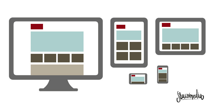
As defined by Wikipedia, the term known as Responsive Web Design (RWD), is a design and development philosophy whose purpose is to adapt the appearance of the web pages to the device that is being used to visualize them, and adjusted properly so that through a single design, a correct visualization is obtained, leaving aside the specific characteristics of these devices: resolution, screen size, power, operating system or memory capacity.
Benefits of our website being Responsive
There are many benefits to this type of design philosophy but I'll highlight a few:
-
Increase your visibility and conversion for tablet and mobile users.
-
Reduce time and costs in both design and development as well as page management.
-
Improve visibility for search engines like Google.
-
Viral content increases.
Conclusion
Don't know if your website is responsive? Do you want a new design for yours? No problem, contact us, we will help and advise you on everything necessary to desgin it properly and do it optimally so this change doesn't have negative consequences in your current search engyne optimization.